Words play a very important role in what we want to convey. If we get deeper in the ocean of words, the type of letters we select, to make a word powerful, creates huge differences. It’s not always about the beautification of words, rather it gives more specification to the message it conveys. The aesthetic value created by the selected letters has a very detailed meaning behind it.
All this selection process takes a lot of thinking and so its no less than an art. The art of putting so much effort on adjusting the text, within design and adding more meaning to it is known as Typography. Definitely we should never just read the book by its cover , but here the cover of typography gives you a strong hint about what you are going to read .
The cover of the book leaves a powerful impact on the readers, because that’s the only thing which gives you the visual message about what the story is. The tone of your page is set by typography.The textual content makes the first impression and so is of huge importance. The medium of communication , attracts the readers and grabs the attention of the reader very easily. It provides a certain mood or feeling, informing about what’s inside it.
Fashion world is very well defined by the typography used in it. For a fashion magazine, the aesthetic enhances more on using a perfect typeface in it.Earlier serifs were used a lot but now taking creativity to another height, personalised fonts are created for fashion magazines. Elle, Vogue, GQ magazines, V magazines are opening their gates and letting in the creative and inventive typefaces, which gives a more luxurious look.
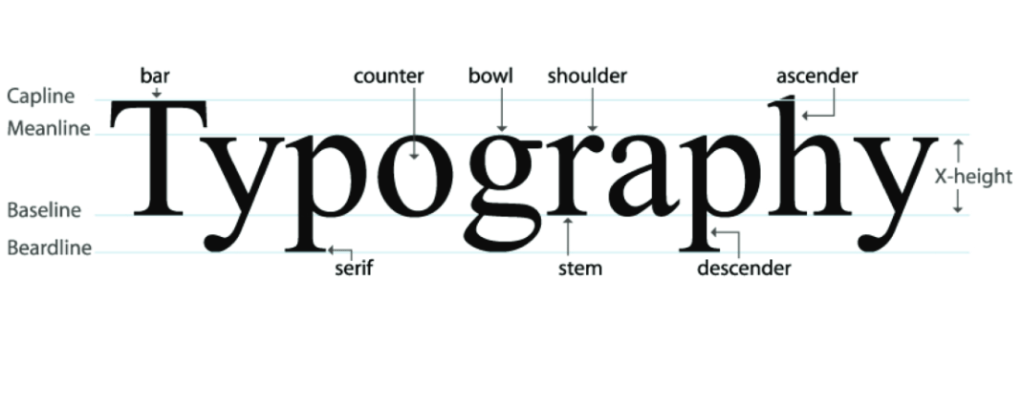
Selecting a perfect typography, requires a culmination of some detailed work that includes arrangement of types such as typefaces, point sizes, line length, line spacing(leading) letter spacing(tracking) and kerning, the space between pairs of letters.
These arrangements give voice to fashion. It was always the differentiator, from the time typography was invented. For film, television, online broadcast, clothing brands, typography worked as a strong bridge to connect to people and show their unique personality. The logos, quotes,brand names all serve a purpose to show how unique the brand is from others.
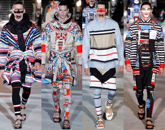
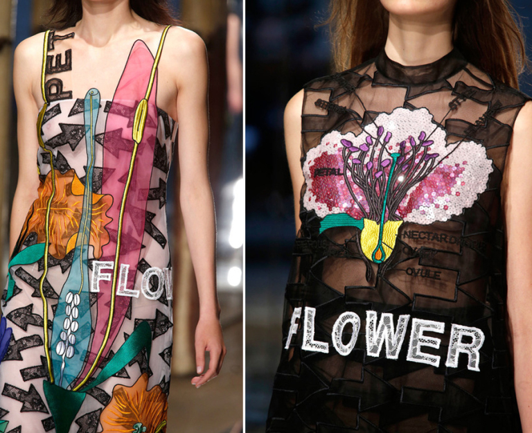
Typography has been used in different ways also for the designers, who never stop themselves from thinking differently and so it’s used as prints also. Typography trend was exhibited in 2014 spring/ summer collections as statement, slogan, logos, handwritten letters and many more.

Christopher Kane illustrated in a text book style combining it with graphic arrows and bold helvetica neue caps.
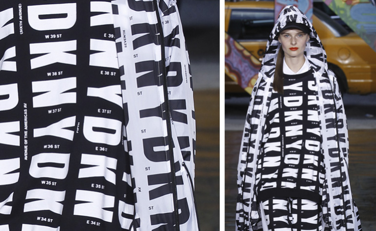
Mimicking the tall, skinny silhouettes of New York city skyscrapers into a font was very well displayed by the designer Donna Karan etc.
Typography with fashion expanded its horizon in a more creative and fascinating way as prints, letters, logos etc.